Contrast is a measure of the difference in perceived "luminance" or brightness between two colours

Contrast Accessibility Tips for Web Designers and Developers
You can have the most beautiful website design, but is it accessible?
Contrast plays such as vital role when it comes to accessibility on the web - so we've compiled some of our contrast tips and tricks to help you design and build more accessible websites.
WCAG
The Web Content Accessibility Guidelines (WCAG) are a set of industry-recognised guidelines by the World Wide Web Consortium (W3C) with the aim of making web content more accessible to those with disabilities.
They have three levels of "conformance", A, AA, and AAA - with the latter being considered the most accessible. To meet these standards, there are various criteria that need to be met in order for a website to be compliant.
In this article, we'll focus on the contrast ratio criteria when it comes to text and typography.
What is "contrast"
"Contrast", put simply is the perceived difference of brightness between two colours.
Let's look at a real word example...
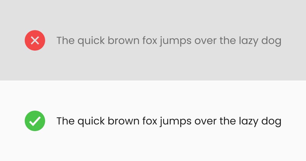
In the above example, the first line of grey text with the grey background has low contrast and would not be deemed as accessible.
The second line of text in dark grey with a white background has high contrast and would be deemed as accessible.
The perceived difference between the foreground text colour and the background colour is the "contrast ratio".
Before we dive into contrast ratios and how to measure them, let's look at why having sufficient contrast is important.
Why sufficient contrast is important
You may be lucky enough to have "normal" vision and you get to browse the web on a colour-accurate and bright screen. You might think the failing text in the above example looks perfectly fine.
Unfortunately, for a lot of people, this isn't the case due to lower-contrast screens, visual impairments and reading difficulties.
Having sufficient contrast when it comes to text has the following benefits:
- Readability: High contrast makes text characters stand out distinctly, making it easier for all users, including those with visual impairments or reading difficulties, to process and understand the content
- Visual Comfort: Insufficient contrast can strain the eyes and cause discomfort, leading to eye fatigue and reduced user engagement. Proper contrast ensures a comfortable viewing experience, which is essential for users spending extended periods of time reading or interacting with digital content
- Accessibility: Many individuals have varying degrees of visual impairments, including colour blindness or low vision. Sufficient contrast helps ensure that content remains accessible to a broader audience. People with visual impairments often rely on assistive technologies which benefit from proper contrast to accurately convey information
- Compliance: WCAG and other accessibility standards mandate specific contrast ratios to ensure digital content is accessible. Meeting these standards not only helps avoid legal issues but also demonstrates a commitment to providing an inclusive user experience
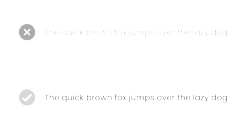
An exaggerated visual impairment example to show the legibility of a low text contrast ratio vs a high text contrast ratio
Contrast ratio
Let's look at the same example as before but with contrast ratio scores:
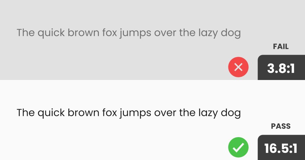
The first line of grey text with the grey background has a contrast ratio of 3.8:1. The minimum contrast ratio to pass "AA" for text at this size is 4.5:1, therefore it is deemed as "insufficient contrast"
The second line of darker black text on a white background meets the requirements and is deemed "sufficient contrast".
This would pass the "AAA" conformance as it has a contrast ratio of 16.5:1 and the minimum in this case for "AAA" is 7:1.
Note: the required contrast ratio changes depending on the font size. In these examples, we'll be concentrating on "regular text"
Tools for checking and calculating text contrast ratios
You can calculate the Contrast Ratio between two colours using this formula:
Contrast Ratio = Luminance of Darkest Element / Luminance of Brightest Element
This isn't exactly easy to do manually - luckily, there are lots of handy tools that can work this out for you!
Colour Contrast Analyser
Colour Contrast Analyser (CCA) is a free app available on Windows and Mac that allows you to easily check contrast ratios on websites, design files or anywhere on your screen.
With CCA you can use its built-in colour picker/dropper or manually enter the foreground and background colour codes to see the contrast ratio.
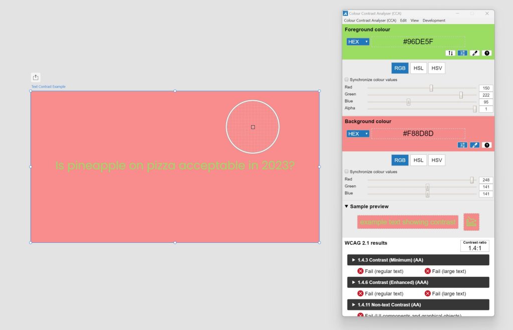
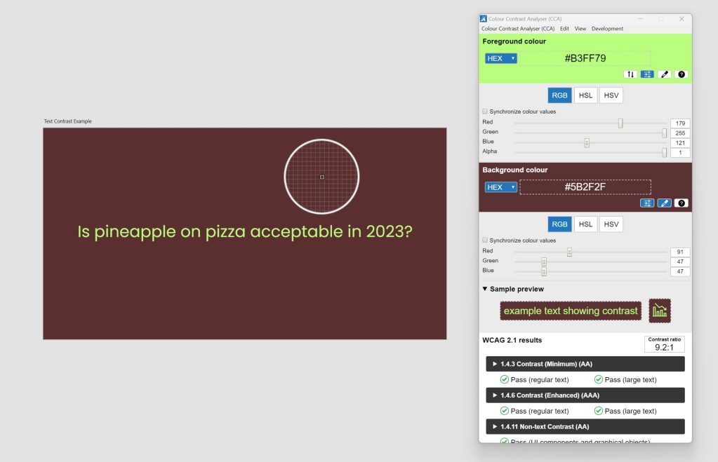
An example of text contrast failing in CCA
In the above example, you can see that the text colour and background colour don't have sufficient contrast to meet A, AA or AAA.
So if we make the text colour lighter and the background colour darker we can increase the contrast...
An example of text contrast passing in CCA
As you can see in the example above, the text contrast now passes!
Chrome Developer Tools
Chrome's developer tools have a built-in colour contrast checker. Some other browsers like Firefox also have similar features.
Inspect an element with text and then click on its colour to see the contrast ratio value:
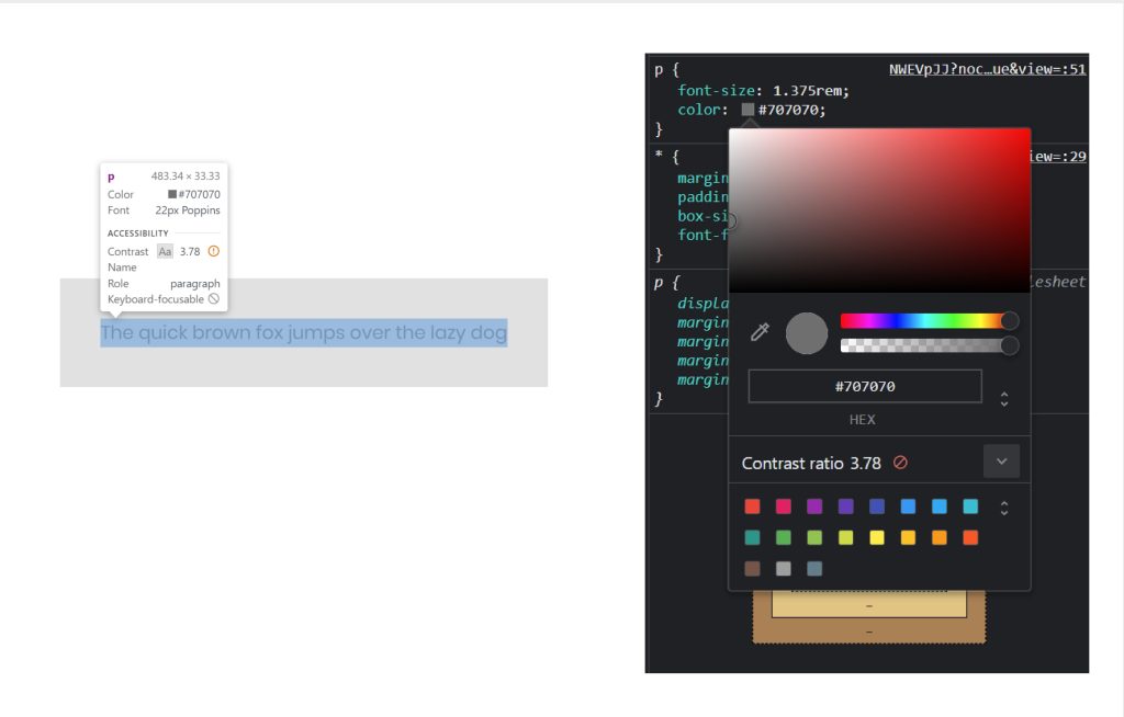
Chrome Dev Tools showing the colour contrast ratio value
As you can see above the contrast ratio is 3.78 and is highlighted to show that it doesn't pass.
If you click on the down arrow next to the score you can view a handy interface that shows you where the text colour would need to be in relation to the background colour to pass at different levels:
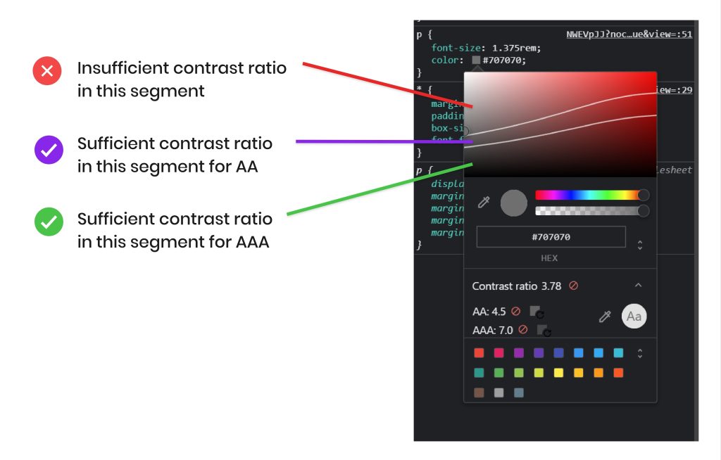
Chrome Dev Tool's handy interface for choosing colours with sufficient contrast
If we move the colour picker into the middle segment, the contrast will now pass for AA:
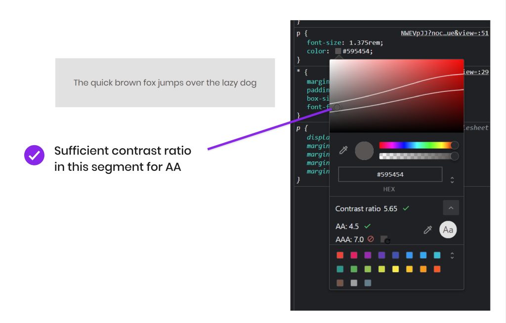
AA pass
But we can go one better by dropping into the lower segment and choosing a text colour that passes for AAA:
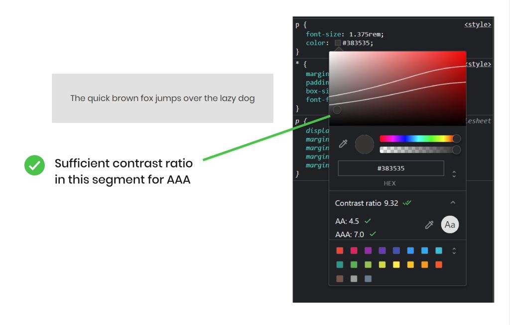
AAA pass
WebAIM Contrast Checker
WebAim has a simple contrast checker on their website and offers a quick way to check if two colours are going to offer sufficient contrast.
You can paste in HEX colour codes to check.
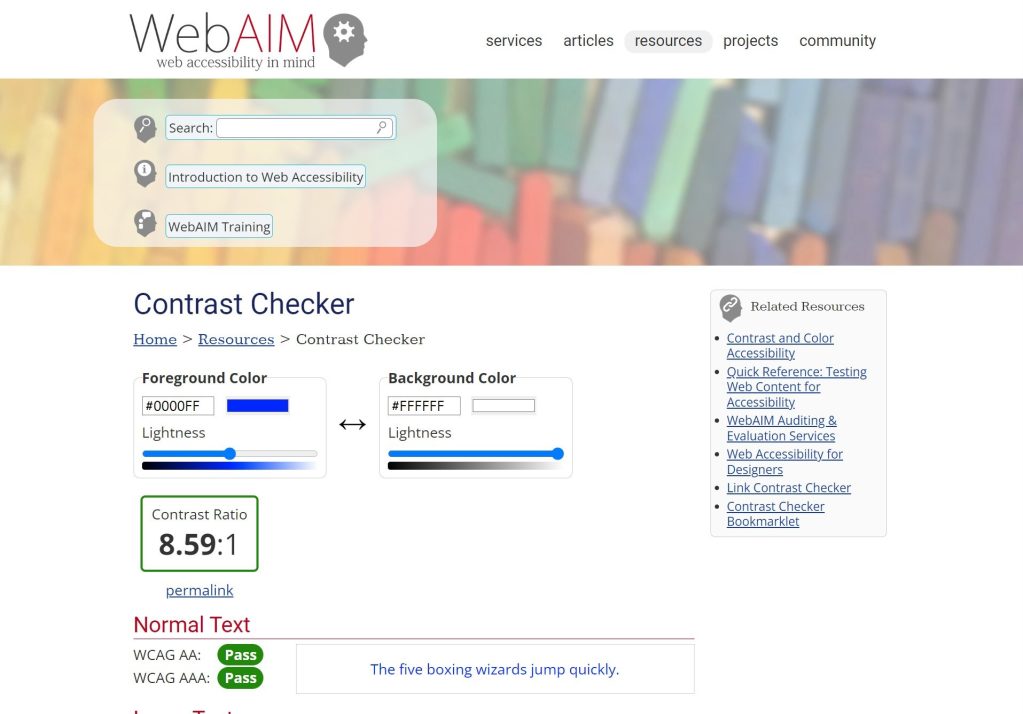
WebAim wbesite Contrast Checker tool
Design considerations
In an ideal world, designs should be accessible from day one. Addressing topics such as contrast should start as early as possible in the design process.
Brand guidelines are often provided by clients that include colour pallets.
It's worth analysing and testing these colours to see what combinations offer sufficient and accessible contrast ratios. These can then be used in your designs.
Sometimes the colours provided in brand guidelines simply don't work well enough when it comes to contrast. In this case, you can opt to create accessible variations of brand colours by muting them or creating "tint" variations.
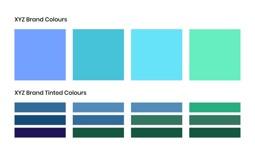
An example of brand colours with tint variations to offer better contrast in designs
Whilst you may have strict design/brand guidelines it's always worth remembering that your website's usability and accessibility are always more important than its aesthetics and should always take priority.
Conclusion and other resources
Contrast is super important when it comes to accessibility on the web and we hope this article helps you deliver more accessible experiences that work for everyone.
You may find the following resources helpful for further reading on contrast and accessibility in general:
Need help with your website's accessibility?
We love making websites accessible to everyone. We can audit your website and help you improve your website's accessibility.
Get in touchCall us 01423 209111
Email us [email protected]